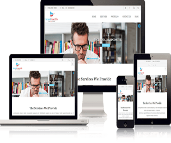
Easy Steps In Responsive Web Design Tutorial
If you have not been living in the caves, you obviously know that internet browsing is no longer restricted to desktops alone. In fact, research says that a greater part of web traffic comes from mobile device users rather than desktop or laptop ones. Hence, getting a responsive website made for your business can be an absolutely great idea, because that way your target customers can view your website even when they are on the go, thus, increasing your chances of conversion. Thanks to CSS3 and HTML5, any good responsive web design company can make you a cross-browser responsive web design.
A responsive web design tutorial for beginners
Here are a few steps that web designers use to design responsive sites. However, this is only one of the approaches that they use considering the requirements and specifications of their clients.
-
Define the viewport mega tag
The browser viewing area gets modified by viewport Meta tag. Hence, defining a particular viewport Meta tag is the first step in developing a responsive site for your business. The default scale is dismissed and the tag instructs the browser to use device width as viewport width.
-
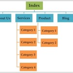
Create the hyper text structure
The next step involves giving your site a structure, by setting a page layout that defines the height of the header, the width of the content container, the side bar and the footer in terms of columns. Besides these, you also need to include supporting images and navigation elements in your HTML structure, if the requirements call for.
-
Get the features of your style sheet set
As you want your site to have certain basic features across all devices, you need to determine the use of certain style features like icons, colour, typeface, etc.
-
Begin with the smallest screen as far as media queries is concerned
Now we have to shift to CSS3 media queries; the main magic that a responsive web design company uses for creating a responsive site. It’s better to begin with smaller widths as it requires the inclusion of smaller amount of content. Set a maximum of 480 px as your width, and set the font and header size accordingly.
-
Move to a larger screen now
By a comparatively larger screen, we mean to say the screen of a tablet. In this case, set 480 px as your minimum width. More columns can be added to display larger content.
-
Media queries for big screen
Finally you will write media queries for desktop screen. Here, the maximum width needs to be somewhere between 769 px to 1100 px.
-
Add content
Once all your relevant commands are defined, it is time to add content to your site. It needs to be in keeping with each of the screen sizes.
-
The images should be flexible
The images in your site have to be according to the media query for the pertinent screen size.
-
Choose flexible embedded videos
Just as in case of images, videos too need to be made flexible.
-
View the final product
Once all the designing and formatting is done, check your site by resizing your browser in PC, and then see it on Android phones, Windows phones, iPhone and iPad.
Get hold of a good responsive web design company and get yourself a responsive site made. You will surely see its positive impact on your business.


Your style is unique in comparison to other folks I have read stuff from. Thank you for posting when you’ve got the opportunity, Guess I will just bookmark this site.
Have you ever considered about including a little bit more than just your articles? I mean, what you say is valuable and everything. However think about if you added some great pictures or video clips to give your posts more, “pop”! Your content is excellent but with images and clips, this website could definitely be one of the best in its field. Good blog!
Awesome website you have here but I was wondering if you knew of any user discussion forums that cover the same topics talked about here? I’d really like to be a part of group where I can get opinions from other knowledgeable individuals that share the same interest. If you have any recommendations, please let me know. Many thanks!
Wonderful work! That is the type of info that should be shared around the internet. Disgrace on Google for no longer positioning this publish upper! Come on over and visit my web site . Thank you =)|
Hi to all, I think every one is getting more from this web site, and
your views are nice in support of new people. Very nice posts.
I just want to tell you that I’m newbie to blogging and really savored this blog. Most likely I want to bookmark your website . You absolutely come with tremendous writings. Thanks a bunch for revealing your blog.
Wow, great article post.Really thank you! Awesome.
Your ideas and words are straightforward for someone like me. Thanks for posting this article.
I loved your blog post.Really looking forward to read more. Cool.