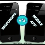
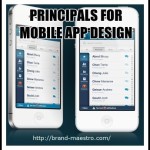
The Advanced Guidelines to Design a Mobile App for Multiple Device
While building an application, the goal of the designer is to cater to different users. A mobile-friendly design is the key to reach out to as many users as possible. So, the biggest challenge for an application designer is to build an app that is compatible to various devices and fit perfectly in every screen size for better user experience. Now, all these things are easier said than done, especially for new a mobile app designer. This blog post is intended for all the newbie app developers in this challenging, interesting and rewarding field. The following paragraphs will let you know how to build an app for multiple device types.
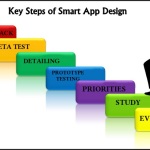
Before you start working on the application, you must plan your project well. How skilfully you structure your project leaves huge impact on the different phases of the design process. At first, grasp a sound understanding of the objectives behind the creation of the app and the group of users it is meant for. Depending on these aspects, you will be required to jot down the requisites to carry out the design work. Now, prepare flow-chart of your project specifying every step and highlighting the crucial ones.
The planning helps prevent any obstacles midway and complete the project effectively on time. Another advantage of a well-structured project plan is that you can stay within the budget. All these will help you to shape a successful career as a mobile app designer.
Building Apps for Multiple Devices – Complimenting varied screen sizes
Your mobile-friendly design must cater to various screen sizes ably. It is important that the format is resized appropriately to support any screen and the UI layout must be in sync with screen configuration. You can do the following to ensure that.
• Consider using ‘wrap_content’ and ‘match_parent’ for adjusting the height and width of view components. In case of wrap_content, the width and height of the display is adjusted to the minimum size. As a result, the display uses only the required amount of space for perfect viewing experience. On the other hand, when using match_parent, the view component is expanded to compliment the size of its original view. Whether a user wants to view in portrait or landscape mode, your app will work best in both cases with the use of ‘wrap_content’ and ‘match_parent’.
• Create layout with the help of Linear Layout and grouping the ‘wrap_content’ and ‘match_parent’ sizes. It is worth mentioning here that you will not be able to manage the spatial relationship of original views with Linear Layout as views here show up next to each. In case you want child views to line up other than side-by-side, you can opt for Relative Layout. With Relative Layout, you have the flexibility to manage the layout according to the spatial relationship between view components. You may place a view on the left side and the other on the right side.
• Although you can create formats compatible to different screen sizes with the help of Relative Layout, let me tell you that this may not be the best bet for positive user experience. So, it becomes necessary to have a few alternative options. Create a number of backup layouts for diverse screen configurations and you have configuration qualifiers or size qualifiers to aid you in this task. If you want to deploy ‘two-pane’ pattern for larger screen sizes, this tool will be of immense help.
• As a mobile app designer, you may encounter the challenge of designing an application for screens having a specified width set in density independent or dp. You can overcome the challenge easily with ‘smallest width qualifier’. This tool makes it easier to work on such screens by determining the smallest side of a particular device in dp units.
• While most formats perform appropriately on both landscape and portrait modes, there are cases where modifications are required. The technique of ‘layout alias’ helps to design the right layout depending on the configuration.
• The images you use need to be compatible to various screen sizes as well. If you use average images, the final output will fall short of standard as images will shrink and blur resulting into negative user experience. You can avoid that with the use of nine-patch bitmaps that help to determine the stretchable areas. Change the bitmap into a nine-patch and then, use it to complement varies sizes.
Building Apps for Multiple Devices – Complementing varied screen densities
When working as a mobile app designer, you must steer clear of mistakes that can thwart a project. One of them is the use of absolute pixels in order to determine screen sizes. Various screens have distinct pixel densities and if you want to determine layout proportions, you can use density independent (dp) unit. A dp matches exactly to the physical size of a pixel at 160 dpi. On the other hand, sp is a same-base unit and helps to define text size.


Leave a Reply