How to Place Powerful Breakpoints in Responsive Web Design
Browser widths, that are a media query command, can make changes in the layout when the browser is in a certain range – these are breakpoints in responsive web design. Well, there is no doubt that breakpoints form a tough part of crafting a responsive website design and frankly speaking, there are very few responsive web design services that can pull out this job with perfection. But, the right techniques can make your job simple and swift. Now, the million dollar question is what are those ‘right’ techniques? Let’s check them out in the following.
What’s the biggest myth about responsive web design breakpoints?
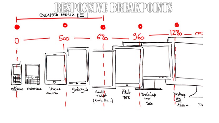
Before jotting down the tactics, let me tell you the wrong notion related to this crucial topic. Responsive web design breakpoints are not dependent on standard screen sizes because there is nothing called a common or a popular screen size. It depends on the layout which varies from one website to another. Screen size and content are not the same in every design. So, it is high time we accept that placing breakpoints based on these parameters is nothing less than a myth.
With responsive web design, a designer endeavors to create a future-proof pattern capable of functioning seamlessly in every browser dimension. So, it is not feasible to take decisions adhering to the current devices. Look up to the widths of these devices as a guide to offer future proof solutions. Focus on layout and apply your foresight to create custom breakpoints.
Top techniques for putting perfect responsive web design breakpoints:
When working on small screens
Remember that screen size has nothing to do with font size and vice versa. The idea of using large font size on a small screen does not click at all for the fact that we always look into mobile phones or tablet devices holding them close to eyes. Do you view your desktop or laptop that close? The answer is obviously ‘no’. So, it is always the type of device and the distance between the device and the eyes that are the deciding factors. Use small font size on small-sized screen. It should be neither too small so that a user needs to zoom in nor it should be too big so that a user requires zooming out. Make sure users are not messed up with constant zoom in and zoom out job in order to view the content properly. Otherwise, the reliability and efficiency of your responsive web design services will be doubted.
When dealing with large screens
A large screen allows to experiment with many design ideas. But, after playing with several ideas, you have to choose one to implement. While you can easily decide on a single column layout, considering a multiple-column outline will be nothing but better, smarter and wiser. Make the most of the big screen size by putting multiple columns for widgets and navigation alongside the main content. Present content attractively with adequate gaps between paragraphs. Do not waste the space for more columns. Fill (not stuff) it with images (that need to be relevant to the content, not for the sake of covering up the gaps).
In short, it all depends on your design needs – the freedom you need to create a design that will be pleasing to the eyes and easy to use. If you feel it is just fine with single column, there is nothing to doubt. On the other hand, if you think a few more columns will enhance the overall appeal, go ahead and materialize your vision.
Content-focused layouts
Pixel-based layouts are a complete no-no. Always create layouts keeping in mind the content. Consider the typeface and white space. Choose a font style that is high on aesthetics and that is easy on the eyes. Experiment until you get the best end result. Make the most of the white space. Present your content in the best possible way with proper margins. See to it that there are not too many words in a line. Otherwise, the content may end looking cluttered.
See from the perspective of a reader. Assume whether these elements are worth implementing or not. When you are offering responsive web design services, your first priority is users’ convenience and whether they will find the product simple and hassle-free to use.
Media queries
Extensive coding can make your site slow. This is something that you will not want definitely. But, you cannot underline the importance of media queries and often it is difficult to decide on the right use of media queries. Going overboard with it can ruin your layout (change your design idea). On the other hand, inadequate use of it will not give the exact output you want. So, what’s the solution then? It is breakpoints. Create breakpoints whenever you are in a fix with media queries.
As you can grasp the fact from the above discussion, there are no set rules for creating responsive web design breakpoints. But, keeping in mind these essentials will help you create a stylish, beautiful and user-friendly design.
Be confident and get set for offering complete responsive web design services with utmost perfection. Best of luck!


Great article! Thanks for this simple steps.
Nice Blog, thanks for sharing this kind of information.