Responsive Web Design Trends 2015
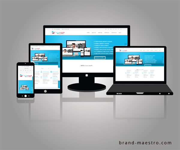
With the introduction and easy availability of the smart devices, internet is being accessed primarily from these devices. In fact, it is being speculated that in 2015 the internet usage on mobile devices will match that of desktops. This denotes that all kinds of businesses should gear up for websites that are compatible with every handheld device. The responsive web design ensures that your website will automatically detect the devices through which it is being viewed and will adapt to the screen size for an easy viewing. Inspite of an increase in the usage of the smartphones, there are certain companies that are still in denial with the fact that responsive web design is one of the prominent trends that should be followed to provide the ultimate user experience.
Besides providing an impressive UX, there are several other reasons why businesses should adapt Responsive web design in 2015. Here’s a list of factors why responsive is recommended –
Search Engine Optimization
Since Google is the giant in the search engine industry, it almost dictates what requires to be done to optimize a website. Amidst the several suggestion provided by Google, responsive design is a primary one. The search engine giant has clearly stated that it favors responsive as compared to the mobile templates. In fact a single URL makes it simpler for the search engine robots to crawl as well as index the websites. This also helps in reducing the errors related to on-page optimization.
Single SEO campaign is adequate
Without a responsive website, a company will have to adopt several campaigns to manage both the mobile version and the conventional website. This will only add to your workload and hinder you from managing your services properly. On the other hand, a business must be able to formulate several SEO campaigns so as to gain the search engine rankings. But when you have a responsive option the SEO campaigning becomes easier. You can formulate a single strategy and it will be applicable to maintain your page rankings and other aspects. Plagiarism for content will also be greatly reduced with this kind of website design.
Decreases bounce rate
While accessing a website on the mobile, a responsive site will offer the users with several kinds of features. It will adapt to the screen size automatically or try to load the mobile version. The latter is often slow and leads to page errors. The users, as a result, might often choose for other websites ranking in the same page results. Hence, it increases the bounce rate. It also refers to the search engines the ability of the website to engage visitors. But those sites with in-built responsive design will instantly fill the screen size of the mobile device as well as the desktop. If the user is happy with the result, he or she will stay on the webpage and help your website in minimizing the bounce rate.
Easy to maintain in long term
When you have a responsive website, it is easier to deal with as compared to the mobile versions of the conventional websites. This is due to the fact that the smart devices are updated at faster paces. Thus, the websites, too, must be updated at quicker speed. This results in expensive maintenance of the mobile sites. If there are pitfalls in updating the sites, it might lead to a negative impact. This is why the responsive sites are preferred as they are at sync with the fast paced technology developments.
Depending on the growth of the mobile users, thus, there is no doubt about resorting to responsive web design. Businesses require expert responsive web designers for creating effective websites. However, it must be noted that it will only work when you implement it the right way. Here are some tips that will help you to build the right responsive website in 2015 –
Improve browsing quality
The businesses must understand the requirements of the browsers. The quality of browsing is important to decide upon. This means that the visual structure must alter as per the screens. This should be done without compromising the quality of the texts, images and grids.
Website with Responsive Compatibility
It has also to be understood that every layout will not suit the responsive layout requirement. Thus, your website must have a simple layout without any glitches. The navigation should be easy to use and the menu should be proper.
Flexible images
Do not get swayed by the images. Make sure that images used are adaptive. There are several resizing tools that can actually help you out. This should be done keeping in mind the handheld devices.
Do away with the unnecessary content
If you are planning to make your website an instant hit, make sure that you do away with all the components that do not match with preview standards set by the mobile devices.
Keeping this tips and tricks in mind will help you to achieve an impressive responsive web design for your business.


This is one of those proper articles I have come across regarding responsive web design. It delivers what it mentions in its title. Good information and well explained. Kudos.