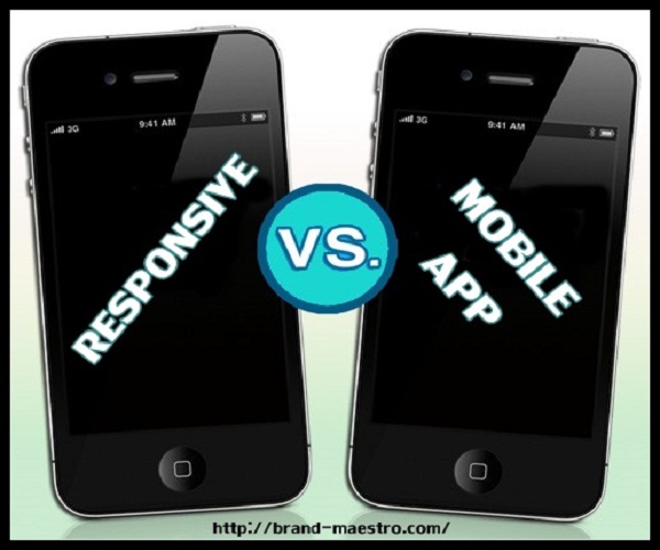
Responsive Web Design Vs Mobile App– Take Your Pick?
When dealing with a hot topic like responsive web design vs. mobile app development, smartphones are to be mentioned for sure. After all, it is smartphone which has redefined responsive web design services and mobile app development by revolutionizing user experience on the web. That is why it makes sense to talk about this wonder device before jumping onto the main topic which is making the choice between responsive web design and mobile app development.
Smartphones are evolving constantly with advanced mobile OS versions hitting the market every now and then. When compared to the previous version, the newer version of a smartphone is equipped with a wider range of mobile web apps that can be streamed from app stores. The apps on smartphones are impeccably designed to offer information with fun to users.
On the other hand, browsing websites on a smartphone is an amazing experience, thanks to the competent responsive web design services that are decking up sites beautifully for proper viewing across various devices. Now, this aspect creates dilemma for the businesses as they become clueless regarding which one among responsive site and mobile application will be the weapon to spread brand awareness. If you are still looking for a solution in this regard, the following discussion may help you.
Responsive web design vs. mobile app development – Delving Deep Into Each Concept!
Responsive web design – the “one-size” solution for all:
As the name suggests, responsive web design responds to a user’s actions on a site by taking into account the screen size, resolution and OS of the device he or she is using. The device can be desktop, laptop, mobile phone or tablet. No matter which device you use to browse a website, you will have no problem in viewing it if the site is responsive. Flexibility or scalability of the size is the most precious element of this design. That is why I choose to say it a ‘one-size’ solution for all.
Whenever a user shifts from one type of device to another, say from laptop to smartphone or from desktop to tablet, a responsive site automatically and promptly fits into the new screen size, resolution and scripting capabilities. Thus, the user does not need to scroll endlessly and keep on zooming in and out for a proper view of the site on the device type he or she has switched from another one. This concept also discards the requirement of a separate mobile version of a site thereby, saving a lot of bucks on design and optimisation.
The use of scalable layouts, images and grids and the wise application of CSS media queries are what that make a responsive website functional. It is a must-have for the strong web presence of a business.
One of the most efficient responsive web design services is your key to get such a striking online presence and reaching out to a large mobile audience.
Our topic is responsive web design vs. mobile app, so let’s talk about the popular concept of mobile app development.
Mobile app development – Special approach to mobile web users:
Mobile app is one of the biggest mobile developments taking place in recent times. It is developed and uploaded in mobile app stores like – Google Play, App Store and etc. The biggest advantage of a mobile app is that it is not dependent on web browser. Users can access the app markets and install their preferred applications on their device.
Today when companies think of catering to as many as mobile web users, they are messed up with idea of making a tough choice – it is whether to go for a mobile website or a mobile application. In recent times, mobile apps are scoring great over mobile websites in terms of brand promotion and usability. This is because it is an awesome combination of the huge resources that the web world provides and the super functionality of smartphones.
A mobile application offers all the benefits of the mobile version of a website. It functions across various devices for example; the same apps can be developed for both iOS and Android platforms. What is even more striking is that a mobile app is equipped with many fabulous features of a native app, such as location-based services, offline browsing, stunning look and more. With a mobile app, you can definitely expect to cater to a large base of your niche customers who are avid mobile web users.
Responsive web design vs. mobile app development – A Concise Comparison
If you are still confused regarding responsive web design vs. mobile app, the following chart of contrast may erase your uncertainty.
[table id=1 /]
Responsive web design vs. mobile app development – Taking the Final Call
I presume it is entirely a personal choice whether you want to go for mobile app development or responsive web design services. After going through the above discussion, you must agree with me on this. So, think and act!


Wow… nice article. The short comparison is well organized by factors and other relevant information. The articles are really covering up latest hot topics indeed.
If I’m not wrong responsive web design is for website browsers and mobile application is for smartphone users. It is not clear to me that how can I compare both of them in a certain way?