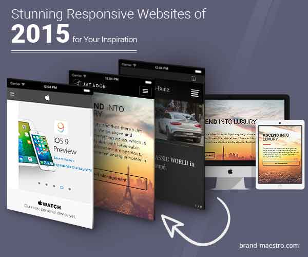
Stunning Responsive Websites of 2015 for Your Inspiration
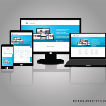
There’s a reason responsive web design (RWD) is right now the bee’s knees. It exemplifies everything that is UX— from easy-to-use navigation, useful and simplistic design, adaptive orientation and resolution, to lightning fast loading speeds.
Using smart CSS, flat-out intuition and flexible layouts and grids, RWD responds to the needs of users in every way possible. It is a UX design element that is exceptionally broad-reaching and encompasses a range of different types of websites among several different industries.
-
Apple – 30 Years of Mac
An incredible website in terms of content, Apple’s thirty years of Mac website combines the theme of putting creative command in everyone’s hands. It enables users scroll big background images in an initial section while a side scrolling timeline shows how Apple has influenced a generation of innovators who go on changing the world.
-
Jet Edge
If there ever was a website that really creates the emotional association of what it is like to fly, new responsive website of Jet Edge has nailed it. As users scroll down on the site’s desktop version, big background images elevate users high into the air. On the other hand, there is a navigation bar that on the homepage measures the five pages in feet, while attention to detail is revealed through added graphics of clouds floating off the ubiquitous wing of the plane.
The responsive website cannot moderately achieve the same emotional association as the desktop site, though, it manages to put the scroll to work and keep the big background images that make the desktop version truly inspiring.
-
Greenland.com
The 2014 responsive redesign of the Greenland.com website is really impressive. The site is driven by charming photography of Greenland that wonderfully renders on both mobile as well as desktop devices. As every image changes, users will feel as if the site has entirely changed without losing the core navigation perception that retain the website together. The website is mostly effective on mobile devices, where you can change the background image with a swipe of your finger.
-
Sonny’s BBQ
The website of Sonny’s BBQ is another great example of a RWD being customized properly depending on the device. The site’s desktop version features scrolling graphics¸ scrolling images and interactivity that makes users hungry, while big CTAs get users where the site wants them to go. By contrast, the tablet and mobile versions of the site focuses on getting users to utilize the main CTAs – by offering simple, large buttons that users can navigate with actively while on the move.
-
Mercedes-Benz
The landing page of 2014 Mercedes-Benz for their new V-Class car is an actually inspiring RWD. The desktop version of the website exhibits a video background that loads extremely fast and highlights the experience of the latest V-Class. Featuring foresight in the form of load time, on mobile devices the video is not featured and it is dropped for equally appealing visuals of the car. The interesting fact about this site is that the site’s mobile version is clearly different depending on purpose from the desktop version. Having a site with two different purposes that are custom-made to two different set of targeted audiences is the best example of a brilliant touch and a great use of the medium of RWD.
By now many internet-savvy companies know that they need to have an impressive mobile or a responsive website so as to keep users engaged with their powerful online presence. However, building a mobile website may sometimes be easier said than done, especially if you don’t have any perspective for how a great website looks like on a mobile device. Hopefully, the above discussion will help you try and inspire and update your business’ decisions when it comes to adding mobile functionality to a new or existing website.


Nice collection. But a big concern with some responsive sites are their loading time. What I liked most in the responsive design approach is the way navigation panel change when I switch from desktop to mobile.