
The Real Picture
A non-responsive website fails to perform its best on mobile devices due to screen compatibility issues. It means a user will not be able to view the website’s attributes properly on a mobile screen, if it is not responsive. Thus, the answer to this problem can be sorted out by deploying responsive web design solutions that offer easy navigation and results in maximum sales conversions.
Some marketers have found that consumers love interactions through which they want to convey their requirements and get those sufficed as soon as possible. This gap can be filled by the deployment of mobile applications that offers seamless completion and fulfillment of set goals.
Here Lies the Debate
One school of thought professed that a marketer should have both responsive website and mobile app. Whereas another sect says that it is wise to have the responsive website first in order to make the consumers aware of the brand an its utility. Then go for developing and deploying mobile apps. The reason is that it becomes an expensive affair to go parallel for developing two platforms.
How to Build an Efficient Mobile First Strategy?
If you are into non-technology business and wish to deliver your offerings through technology driven platform, then it is tough to decide whether you want to go for an app or a website first. Take your time and learn how your target audience behaves.
Think, what are the best possible ways you can reach them? You have to consider regarding how you can simplify their tasks that they perform often. When you have found answers to these issues, you can easily decide the best ways of offering solutions through mobile or web first strategy.
Whether you require both responsive website and mobile application also depends upon the offering you have devised. For example, if you want to educate your customers for using your products, you can develop an app that offers guidelines and such application does not consume any bandwidth to become functional.
You can see that in order to engage your customers through your offerings and to make them loyal to your brand, both platforms are required. The app platform turns into a value added service.
The Best Way of Developing Mobile Applications
You already know that smartphones come in various styles and shapes. Due to varied screen sizes, compatibility issue arises, which can be sorted through responsive web design. However, these phones work by using various operating systems. For that reason, you have to ensure that the app, which you deploy, runs well on these devices.
At the initial stage, you should go for developing responsive site. You need to add certain analytics tools, through which you can know about the devices used by consumers the most. Then you can resume the task of the application development that fits well with the operating system of the device. With proper mobile application UI design, your target audience can suffice its needs happily.
The bottom line is that you require both mobile app and responsive site for building a strong brand value and engage your customers for sufficing their needs.
]]>Opposing the”big bang”approach, i.e. redesigning the website all at once, Growth Driven Design provides an incremental approach where you can bite just as much as you can chew. This approach helps you:
- To improvise your website continuously
- Eliminate the guesswork from the designing process
- Save your as well as your team’s time
- Launch the website in 1/2 the time of a traditional web re-designing process
What you can expect from Growth Driven Design
- Continuous data driven improvement
Almost four in every ten firms have opted for re-design in the last 1 and ½ year or so, not on the basis of any metrics. So how they figured out that their website is not performing well?
When it comes to best website designs, designers often make incorrect hypothesis about how a firm’s target customers will make use of the website. Growth Driven Design eliminates this guess-working phase, because you are constantly determining, making assumptions, changing and examining how it affects your business.
After the 1st few weeks of the project, the service page, about us page, case studies, testimonials etc., has to be revisited. You have to re-write, refine, test and improvise one or two of them at a time. Through this methodical approach you can maximize traffic and lead via your website.
- The cost of web design can be segmented into budget-friendly portions
As per the sources, a traditional business website re-design will cost around $15,000 (the price greatly varies depending on the requirement). Cashing the amount all a time is a big blow to the company. On the other hand, a Growth Driven Design will usually cost you approx $2,500 monthly again, the prices may vary). This is a budget- friendly option. As the fee per month is all-inclusive, it comprises of updates, maintenance, backups, hosting and installing new features eventually.
- Ideal fit for inbound marketing
Compile inbound marketing and Growth Driven Design together and you will find out a success mantra! This kind of web design together with inbound marketing implies that you can attract more users or visitors to your website that skillfully converts prospective customers to leads. Your cost per lead will reduce eventually as your website will be more capable of drawing visitors and make them loyal customers.
- Generate business results and sales revenue through your website
The Growth Driven design approach can convert your website form a mere brochure to a powerful tool for selling, because the approach focus on computing metrics that delivers real business results. Google provides additional advantages to those websites where the content is fresh. Therefore, website developers find it easy to upload new contents every month via this approach.
If your firm is planning for a website redesign and budgeting for the same, try exploring the potentials that a Growth Driven Design could offer. This approach is exclusively designed to make your corporate website a real sales tool that draws visitors and converts them to customers. Hope this blog helps you to decide on what is best for your website.
]]>
Stage before coding
Keep in mind that “broken” is not just related to parse errors. Broken user flows and bad ideas kill a project. So, its better to start with sketching. It is not strange for a designer to draw a several hundred concepts for every user view or flow, and meet a client with 40 -50 pages in hand. Yes, they are handy, easy to make and throw. If your hand cannot do the trick, it is better to rely on some efficient sketching tools to help avoid problems at high levels. Especially, when it comes to responsive web design, every page must contain different configurations for a range of screen sizes, device potentials and other factors.
A quick drawing illustrates:
-
What does not appear or appear on every page, per configuration
-
How the elements have been arranged
-
How small the images look on mobile devices
Sketching different sizes of the same site will help you to forecast the design problems before they actually occur.
Visual checklist of responsive designs
A mobile application designer is by far a visual being. When they create responsive designs, they tend to consider the desktop sketch first to help clients get a better grasp of the style and structure. Yet, the end product has to be mobile friendly! Follow this visual checklist:
-
Print your work. Nothing can beat a hard copy for instant, throw-away edits.
-
Circle the call- to-action points on the page.
-
Keeping aside those elements that draw a direct path to the circled points, cross out the rest. For example: if you are designing a marketing website, it can comprise of a banner, a text for about a paragraph. Cross out the sidebar, zap the navigation bar and the footer. There is no need to show mercy. It is only a piece of paper.
-
It is recommended that you sketch out analog with detail. Lay out a mobile version of the page with essential elements defined earlier.
-
Once you rough out those elements, add the elements you crossed out previously, but it should assist the entire site like link-laden footer or navigation.
The left out stuffs are the essential elements and mainstay of the page.
Execution in real-life scenarios
Only resizing your browser window will not stand tall for responsive web design. The design thinking process of responsive web design companies should consist of numerous feedbacks and quick iterations. As soon as you begin to code, you should start testing. The new versions of the framework have to support around a dozen of diverse devices to catch most use cases. The best practice comprises of testing works on live servers, but before you deploy it and obviously before you release it.
Using spreadsheet tracking system
Without overhead, it is hard to solve design and technical problems. So, it is better if you rely on a shared Google spreadsheet for tracking what is working and what is not. Make separate color backgrounds to indicate:
-
What failed
-
What is working
-
What is working partially
-
What has not yet been tested
Each column of the spreadsheet will describe a page or view per stage. For example: users and administrators may view the same dashboard, but with diverse controls. Put them in two separate columns.
As the bugs and errors get fixed, change the colored boxes into green. This is a great way to solve problems related to responsive web design pretty quick and a better way to keep things under supervision.
]]>Using smart CSS, flat-out intuition and flexible layouts and grids, RWD responds to the needs of users in every way possible. It is a UX design element that is exceptionally broad-reaching and encompasses a range of different types of websites among several different industries.
-
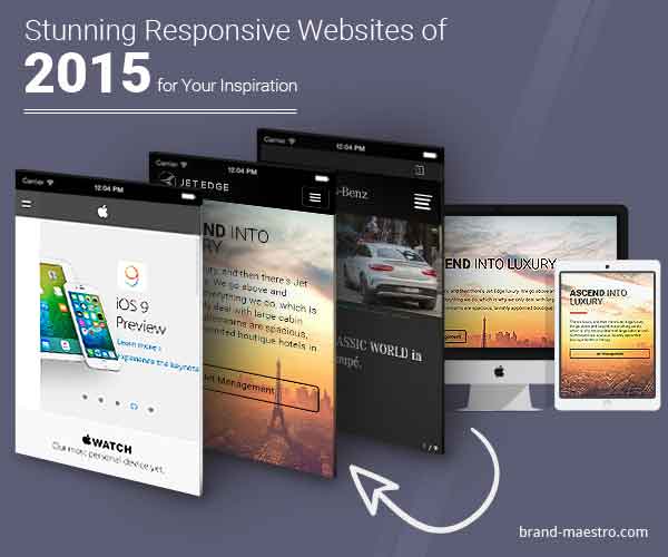
Apple – 30 Years of Mac
An incredible website in terms of content, Apple’s thirty years of Mac website combines the theme of putting creative command in everyone’s hands. It enables users scroll big background images in an initial section while a side scrolling timeline shows how Apple has influenced a generation of innovators who go on changing the world.
-
Jet Edge
If there ever was a website that really creates the emotional association of what it is like to fly, new responsive website of Jet Edge has nailed it. As users scroll down on the site’s desktop version, big background images elevate users high into the air. On the other hand, there is a navigation bar that on the homepage measures the five pages in feet, while attention to detail is revealed through added graphics of clouds floating off the ubiquitous wing of the plane.
The responsive website cannot moderately achieve the same emotional association as the desktop site, though, it manages to put the scroll to work and keep the big background images that make the desktop version truly inspiring.
-
Greenland.com
The 2014 responsive redesign of the Greenland.com website is really impressive. The site is driven by charming photography of Greenland that wonderfully renders on both mobile as well as desktop devices. As every image changes, users will feel as if the site has entirely changed without losing the core navigation perception that retain the website together. The website is mostly effective on mobile devices, where you can change the background image with a swipe of your finger.
-
Sonny’s BBQ
The website of Sonny’s BBQ is another great example of a RWD being customized properly depending on the device. The site’s desktop version features scrolling graphics¸ scrolling images and interactivity that makes users hungry, while big CTAs get users where the site wants them to go. By contrast, the tablet and mobile versions of the site focuses on getting users to utilize the main CTAs – by offering simple, large buttons that users can navigate with actively while on the move.
-
Mercedes-Benz
The landing page of 2014 Mercedes-Benz for their new V-Class car is an actually inspiring RWD. The desktop version of the website exhibits a video background that loads extremely fast and highlights the experience of the latest V-Class. Featuring foresight in the form of load time, on mobile devices the video is not featured and it is dropped for equally appealing visuals of the car. The interesting fact about this site is that the site’s mobile version is clearly different depending on purpose from the desktop version. Having a site with two different purposes that are custom-made to two different set of targeted audiences is the best example of a brilliant touch and a great use of the medium of RWD.
By now many internet-savvy companies know that they need to have an impressive mobile or a responsive website so as to keep users engaged with their powerful online presence. However, building a mobile website may sometimes be easier said than done, especially if you don’t have any perspective for how a great website looks like on a mobile device. Hopefully, the above discussion will help you try and inspire and update your business’ decisions when it comes to adding mobile functionality to a new or existing website.
]]>The biggest mistake that many website owners commit is to design a site for PC and then convert the contents into mobile version. This causes users to face difficulty, as the fonts do not fit the size of the screen most of the time. The best way to overcome this problem is to go for responsive web design that makes fonts of web pages compatible with the mobile devices. While creating mobile optimized sites, professionals of a responsive web design company take utmost care for displaying web pages, contents and buttons to offer suitable experience to mobile users.

Another option, which web development services deploy for attaining mobile design flexibility, is the usage of alternate layout. Adobe Muse helps in creating separate site for mobile visitors and redirects them according to screen resolution. The advantage of alternate layout to developers is superb design flexibility, control and ability of optimizing a mobile website for unique set of meta data and keywords.
Whether you want to go for responsive web design or develop an alternate layout for your website, you have to take some design considerations in to account, so that your site looks impressive as well as rank well during searches.
• Avoid creating tiny buttons
• Use scroll for making fonts legible
• Avoid using rich contents and widgets
• Ensure fast loading of pages
• Use suitable cross links
Avoid Creating Tiny Buttons
While designing a mobile website, you have to create large buttons. This helps users in comfortably pressing buttons on your website with their fingers. Do not place buttons closely each other or else a user will hit wrong one. For safe usage, you have to build sizes in 50px by 50px format. For spacing, follow 20px – 32px format.
Use Scroll for Making Fonts Legible
Mobile users are always in hurry and many mobile websites are devoid of zooming facilities. As tiny texts are difficult to read, you have to take advantage of mobile users’ ability of scrolling and develop long pages with contents displayed in comfortable size.
Ensure Fast Loading of Web Page
While designing a mobile site, ensure that it should be streamlined, leaned and light. Users may not avail Wi-Fi connection every time. Therefore, it takes lot of time for loading video rich sites. For ensuring navigator’s satisfaction, mobile pages should load in short time and images should be optimized for maximum compression. Avoid including complex widgets as they make the mobile page design bulky. You should always think how navigators would use your site. So, design it accordingly.
Avoid Using Rich Content and Widgets
The most demanded mobile sites are simple, fast and light. Save your high-resolution video galleries and parallax scrolling effects for desktop usage. As a part of algorithm change, Goggle has confirmed inaccessible content like Flash that will have negative impact on ranking.
If your embedded media or widget fails to raise user experience, then remove the same and implement easier or faster way for displaying contents. For example, instead of showing video regarding customer endorsement, you put quotes of your clients that can be easily scrolled through.
Use Suitable Cross Links
Websites that have separate URLs for mobile and desktop versions, it is the common practice to include links, which can connect two versions. While going for responsive web design, see that should connect the relevant counterpart.
Follow the above-mentioned tips for creating user- friendly mobile site that will help visitors search and find contents easily and add revenue to your business.
]]>Mobile Optimization plays a cardinal role in the success of any business entity and its online network. No wonders, it is a crucial for SEO rankings and enhanced online visibility. While the big names of the industry have already started soaking the benefits, small to medium sized businesses (SMBs) are still bereft of the luxury. They are still mired in the confusion, wondering what would be great for them – a responsive site, a mobile app or a mobile site.

Toss the worries out as here is the most commendable advice for SMBs. Launch a mobile responsive site using best responsive web design services that create magic for the business and its growth rate. Transforming a regular portal to a responsive site is a worthy investment and regular upgrade can leverage the business significantly.
A Must-do For Better Visibility
Being a time-consuming and expensive process, SMBs remain disinclined to adopt the trend. Reason being the lack of resources or perhaps the lack of perception.It is imperative to follow the practice of mobile optimization to generate more leads and better visibility. Search Engines, like Google and Bing, are quick enough to detect the mobile-friendly sites from the sea of others. Thus, an aversion to the idea can have a direct and negative bearing on the business, especially when the competitors are making millions out of it and dethroning the rest.
Improved Efficiency, Reduced Costs
Small businesses face a tough time to make it to the mobile. They keep cudgeling their brains on what steps to be taken for bringing in more revenue and customers. A responsive website boosts the efficiency at all levels and opens wide windows of opportunities. SMBs, which shy away from making huge investments, must acknowledge the fact that a responsive site simplify SEO. By resorting tothe responsive web design services, such companies pay for a single site only, which runs brilliantly on all devices,providing a picture-perfect view. Thus, a significant drop in expenses is obvious.
Browsing Bonanza
For a prolonged spell of good times, SMBs must adapt to the mobile responsive culture because such websites are deeply cherished by the customers for their spectacular working and smooth navigability. The customers stay away from the hassles of continuous zooming and scaling, offering wonderful user experience. Whatever is significant, it appears on the screen accurately. Therefore, SMBs can expect a big swell in the customer list through mobile optimization. Responsive web design service providers create intuitive and flexible designs and templates at reasonable rates for SMBs.
Easy Maintenance, Great Sharing
Maintenance of responsive sites is a breeze and a great reason for SMBs to give it a shot. As there is just one universal HTML code for all websites, such companies are required to spend relatively less on maintenance and implementation. Another perk of mobile optimized site is the easy sharing feature it offers. One single URL makes sharing and linking the content a child’s play.
By Responsive Website Design, one name that immediately springs to the mind is ‘Skinny Ties’. The skinny ties e-commerce portal is spectacularly streamlined and created to work at a super-fast speed. Both the original and mobile versions have won laurels for its splendid construction and smooth mechanism. Users are sure to fall for this outstanding digital piece for its style and overall composition. The RWD bags ten out of ten.
Realizing such tremendous benefits, one thing is certainly clear – Responsive web design is a sensation today, and will be the future tomorrow. It’s high time to go MOBILE.
]]>
The W3C guidelines for Mobile Web Best Practices discuss the ‘One Web’ approach. This refers to providing “the same information and services available to users irrespective of the device they are using. However, it does not mean that exactly the same information is available in exactly the same representation across all devices. The context of mobile use, device capability variations, bandwidth issues and mobile network capabilities all affect the representation.” In order to adapt this approach the organization should choose between responsive or adaptive web designs. But before listing the differences, let’s define these web design techniques for you.
What is Responsive Web Design?
In case, you are unfamiliar with this term, responsive web design is a type of design that will adjust perfectly to the device you are using, for instance, tablet, desktop or smartphones. While the content will remain the same, the design is made in such a way that it will easily fit the interface. This is not a technology. Rather it is a design based approach that can solve all the problems related to the varying screen sizes. Thus, the websites can perform irrespective of device or resolution issues. The responsive design is significant for the mobile users for providing a complete experience. In the recent years mobile has become one of the key devices for accessing internet.
The term was coined by Ethan Marcotte. It is one of the most common ways to make your website mobile friendly where CSS3 is incorporated along with media queries and fluid grids that utilizes percentages to develop a flexible base. In addition to these, flexible images and videos are also used so that the website layout can adapt itself to any of the viewing devices or environments.
What is Adaptive Web Design?
For both Adaptive and Responsive the basic notion is the same. The main aim is to create a website that will work on multiple screens. However, Adaptive Web Design uses a detection script on the web server. It can automatically identify the device that the user utilizes to visit the website. Accordingly, it delivers a suitable version for that site owing to the capabilities and the size of the device.
Adaptive Web Design uses the various components of PE (progressive enhancement) in the design process so that they can identify the user instread of the brwoser. Predefined layout sizes are used depending on the size of the screen. JavaScript and CSS are used in the layouts. AWD is the predeccessor of RWD. It has coined at a time when Media Queries (CSS3) were not known to the web world. The key difference between these two design processes is that one uses Media Queries and the other does not.
If you are looking for an alternative to Responsive, then it has to be the Adaptive way. The most important difference is that the server that hosts the website will detect the device. This information is then delivered to various branches of CSS and HTML codes depending on the features of the detected device. What it significantly delivers is an experience that is built specifically for the mobile customers.
Differences Between Adaptive Web Design and Responsive Web Design
The primary difference between the two is that Adaptive adapts the device and screen dimensions while Responsive changes fluidly and responds to fit screen sizes. But there are other differences between them as well –
Separate websites have to be developed and maintained for AWD either with the help of separate CSS/HTML codes or by separate URL. For Responsive Web Design HTML or CSS3 and JavaScript is used. Thus, there is no need to maintain separate URLS or CSS/HTMLs.
Secondly, if your website is adaptive then every time you make a change, you will have reqork on SEO, linking and content. In comparison, the HTML/CSS3 and Javascript in responsive allows you to easily make the changes that will be carried over.
Adapative Websites depend on the predefined screen sizes. RWD relies on fluid and flexible grids. The latter needs more numbers of coding and plans to implement them so that the webpages fit the varying screen sizes.
Fourthly, the adaptive web designs are applied on a website that already exists. However, in case of responsive web designs the website should be built from scratch.
Inspite of the advantages, RWD is applied more than AWD. There are primarily 3 reasons for this –
1. Since the customers can browse through the information of their choice easily, the retention of the brand increases. Responsive web design successfully captures the attention of the users owing to its convenience.
2. Responsive websites are easy to surf from a mobile device. As a result, one can work faster on it than a conventional desktop. Hence, the turnaround is faster.
3. Every business desires a global approach. With its customers spread across the world, it is vital for the company to be available for its customers round clock. A mobile web app increases accessibility.
Finally, it is upto the business to decide which one will be right one. Both the website designs have their own merits. The only way to find out which is more applicable is by putting the need of the customers first as well as the business goals.
]]>What are the popularly employed techniques?
According to Pew Research Internet Project 90% adults have cellphones while 58% of them are using smartphones and 42% have a tablet. Optimizing the websites with mobile technology only help in creating better value for the customers. It enables the consumers to see your products or services anytime, anywhere. Therefore, several techniques are being adapted by the developers so as to optimize the sites for mobile technology including mobile stylesheets, using fluid layouts, creating stylesheets specific to platforms, doing away with unnecessary content, etc.

Exploring the technologies
Mobile stylesheet comprises the creation of an alternative CSS style that has been optimized specifically for the handheld devices by making use of a similar kind of HTML markup. Another technology employed by the developers is the fluid layouts. This implies that no fixed width, height etc are applied so that the elements can be resized depending on the size of the screen. The platform specific stylesheets ensure that there is a specific one for each mobile platform including iPhone, Windows or Android phones.
Technology is ever growing and as it progresses, it will create an impact on the mobile devices as well. To keep in sync with the new mobile devices, web development will be compelled to adapt to the new demands from the users. Here’s a quick list that points out how mobile technology has influenced the website design in the recent years –
Responsive Web Design
There has been an apparent shift to RWD in the recent years and understandably so. For those savvy web developers and web users, responsive web design is irreplaceable. As a business owner if you are aiming at providing uncompromising user experience then you cannot overlook this web design pattern. The impact of RWD was apparent when in 2013 Facebook announced changes in its News Feed that was completely based on the principles of responsive design. Today, it is no more a trend but a necessity that the web developers simply cannot ignore.
Longer pages
This is a trend that took many by surprise. Even a couple of years back, short website pages were in vogue where the users did not have to scroll down incessantly for information. Since last year there has been a major shift in this trend as longer pages were included in the websites. The reason for this is that users prefer scrolling down and viewing information on the same page instead of reloading a new one.
Getting rid of the side bar
A few years back it was quite common to include around 2 or 3 columns in the website design. There were columns for the side menu, content and another one for showing the quick links. However, now it is all about displaying the website centrally while it is designed organically based on the content. There are no more sidebars to take care of.
Centralizing elements
If you notice carefully, you will find that the new trend in website design is to include all the elements (even the logo) centrally. The information as well as the other components will appear on the middle of your mobile screens. It renders a more cleaner and smarter look.
Ditch the mobile sites
With the responsive website becoming more dominant, it is time to bid farewell to the mobile site concept. It is estimated that by the end of 2015, the mobile sites will be completely phased out. Besides RWD, mobile apps, too have contributed significantly in shifting away from the mobile websites. The need of the hour is to build sites that are not only optimized for mobiles but they will look great on desktops as well.
Simplicity and innovation score
Do you have ample to time to deal with complexities? Neither does the users. Creating complex sites will repel the browsers. Right from industry bigwigs to development experts, all are of the view that too much content or a huge website will not have the desired impact. Although more content ensures that you index and that is good for search engine rankings. But the trend is to harp on quality rather than quantity. While enterprise websites might have thousands of pages but a small business site does not require the same.
It is equally important to innovate. There are several websites that appear similar. It is time to move away from such similarities and create something new.
The concern here is that it isn’t easy to keep up with all the changes taking place in mobile website design services owing to the growth of mobile technology. It would be interesting to see how designers and developers can play along innovatively with the dynamic design elements and use the minimal to achieve a maximum impact.
]]>
Besides providing an impressive UX, there are several other reasons why businesses should adapt Responsive web design in 2015. Here’s a list of factors why responsive is recommended –
Search Engine Optimization
Since Google is the giant in the search engine industry, it almost dictates what requires to be done to optimize a website. Amidst the several suggestion provided by Google, responsive design is a primary one. The search engine giant has clearly stated that it favors responsive as compared to the mobile templates. In fact a single URL makes it simpler for the search engine robots to crawl as well as index the websites. This also helps in reducing the errors related to on-page optimization.
Single SEO campaign is adequate
Without a responsive website, a company will have to adopt several campaigns to manage both the mobile version and the conventional website. This will only add to your workload and hinder you from managing your services properly. On the other hand, a business must be able to formulate several SEO campaigns so as to gain the search engine rankings. But when you have a responsive option the SEO campaigning becomes easier. You can formulate a single strategy and it will be applicable to maintain your page rankings and other aspects. Plagiarism for content will also be greatly reduced with this kind of website design.
Decreases bounce rate
While accessing a website on the mobile, a responsive site will offer the users with several kinds of features. It will adapt to the screen size automatically or try to load the mobile version. The latter is often slow and leads to page errors. The users, as a result, might often choose for other websites ranking in the same page results. Hence, it increases the bounce rate. It also refers to the search engines the ability of the website to engage visitors. But those sites with in-built responsive design will instantly fill the screen size of the mobile device as well as the desktop. If the user is happy with the result, he or she will stay on the webpage and help your website in minimizing the bounce rate.
Easy to maintain in long term
When you have a responsive website, it is easier to deal with as compared to the mobile versions of the conventional websites. This is due to the fact that the smart devices are updated at faster paces. Thus, the websites, too, must be updated at quicker speed. This results in expensive maintenance of the mobile sites. If there are pitfalls in updating the sites, it might lead to a negative impact. This is why the responsive sites are preferred as they are at sync with the fast paced technology developments.
Depending on the growth of the mobile users, thus, there is no doubt about resorting to responsive web design. Businesses require expert responsive web designers for creating effective websites. However, it must be noted that it will only work when you implement it the right way. Here are some tips that will help you to build the right responsive website in 2015 –
Improve browsing quality
The businesses must understand the requirements of the browsers. The quality of browsing is important to decide upon. This means that the visual structure must alter as per the screens. This should be done without compromising the quality of the texts, images and grids.
Website with Responsive Compatibility
It has also to be understood that every layout will not suit the responsive layout requirement. Thus, your website must have a simple layout without any glitches. The navigation should be easy to use and the menu should be proper.
Flexible images
Do not get swayed by the images. Make sure that images used are adaptive. There are several resizing tools that can actually help you out. This should be done keeping in mind the handheld devices.
Do away with the unnecessary content
If you are planning to make your website an instant hit, make sure that you do away with all the components that do not match with preview standards set by the mobile devices.
Keeping this tips and tricks in mind will help you to achieve an impressive responsive web design for your business.
]]>