The 5 Common Mistakes of Website Navigation. Are You Aware Of These?
Building a website is a piece of cake. There are numerous software which have made this a reality sans web design services. Even inexperienced people with no knowledge of coding or designing can create websites. However, when it comes to your business, building just about any website is not feasible for your visibility and traffic factor. While building websites on our own, we often commit some blunders which come at the expense of our search engine rankings. One of the most important factors to affect the search engine rankings of a website is its navigation since it is associated with user-friendliness and conversions. However, most of us ignore its importance, leading to some common mistakes.
Do you want to cross-check whether you are one of those people? Then what are you holding on to? Read on.
A hide-and-seek playing menu, not up to any good >> When you make visitors actually make efforts to search and find the menu, you make a huge mistake which is more common than you think it is. You make think that a hide and seek menu adds to the uniqueness of your website, but the truth of the matter is that your visitors do not have the time to play hide and seek with your site; they are hard pressed for time as it is, so just give them what they want fast. Otherwise they might simply leave the site and try to find what they are looking for elsewhere.
Complicated designing of common website navigation panel >> Now, you have to remember one thing- simplicity is the key to everything! You might feel that designing a unique website will mark you out from the rest of the crowd, but in that process you might make your design way too complicated for the liking of the common crowd. Keep in mind that you have to make your website easily navigable so that they can effortlessly access what they are looking for. Including some common elements will not really make you seem identical to all other sites. When your navigation is put in normal places, your site will be easier to use.
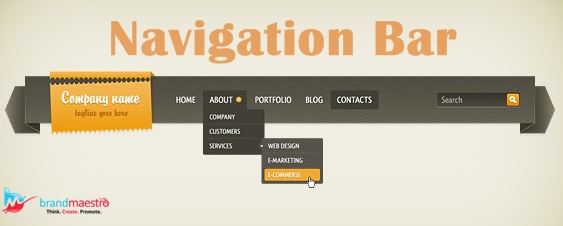
Are the interaction designs too hard to use? >> When we use interaction designs, it might add something new to the site but more often than not they simply act as hindrances. Examples in point are the horizontal drop down menus which disappear when the cursor stops hovering over them and fly out menus which open to right from the drop down or vertical main navigation. These have the common drawback- the cursor must be moved carefully and in case of overshooting the item of interest simply disappears. Even instantly responding vertical drop downs may turn out to be problematic. The best option when including this kind of menu is to make sure that the menu persists for a second even if the cursor overshoots.
Stop being too clever or trying to be different >> Being creative is good, but professional web design services know when and where to use this creativity. The navigation should be kept somewhat predictable; instead try to show your creativity in your content or images. There is no point in using clever names and synonyms to add some uniqueness if your target audience cannot catch the meaning. So it is best to opt for ‘Contact us’ and not something like ‘Give a Shout to Us’. Also the navigation links should be free from the so-called ‘well known’ terminologies that you use internally in the industry; you might be absolutely familiar with them but the visitors who are visiting your site are just common people who have no clue about them. When going for web design services, it might be a good idea to involve your employees who deal with your customers on a regular basis so that the terms that they can relate to can be used.
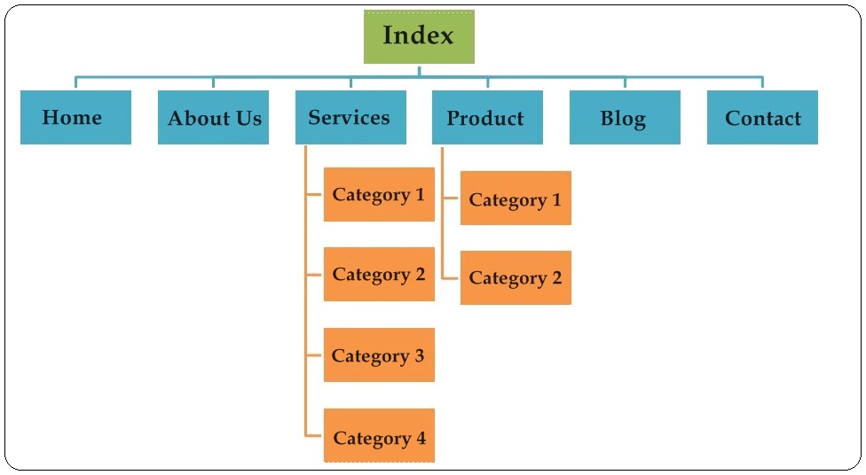
Too many is not too good for common website navigation panels >> This is something all of us have faced at some time or other ourselves when browsing through sites. Some sites have evolved over time leading to a lot of content. This results in most people trying to cram everything in the site. But it is never a good idea to include too many links on your home page. Include few items so that your visitors can scan the most important items quickly; with lesser items, those that are present get more prominence. Remember conciseness is the key!
When going for web design services, remember that your site must be a perfect balance of creativity and functionality. So try to showcase your creativity but do remember to provide all the functionality by avoiding the mistakes mentioned above.





Magnificent beat ! I would like to appreciate while you amend
your web site, how can i subscribe for your blog write ups?
Thanks Meir. You can subscribe our newsletter for more articles.
Its like you read my mind! You seem to know a lot about this, like you
wrote the book in it or something. I think that yyou could do with a few pics to drive the message hopme a little bit, but instead of
that, this is fantastic blog. A great read. I will definitely
be back.
Thanks Meir
Wow, superb blog layout! How long have you been blogging for?
you made blogging look easy. The overall look of your website is magnificent, as well as the content!