Powerful Ecommerce Web Design Tips For User-friendly Websites
These days, there is not a single soul who has not turned to online shopping portals for their needs. Most people opt for this to avoid lining up in stores. So there are many companies who are opting for ecommerce so that they can reap the full benefits and offer their customers the ease of online shopping. However, this field is quite competitive since there are many companies who are turning to this and the rivals are simply a click away. In case customers do not like a site then they turn to other sites so that they can buy the products that they are looking for. In order to attract attention and gain more clients, the ecommerce website design should be as customer-friendly and usable as possible. Even if the prices are low and the products are the best in market, if the customers find it confusing to navigate your website then it will be very difficult to reach any preset target.

#1 Clean design:
The first and foremost requirement for any website is a clean design; but this factor is especially important for e-commerce ones. This is mostly vital since such a design helps one to have a clear focus on the products of the website. This enables a visitor to know immediately about the items being sold when he or she visits the website. So it is essential that the home page displays large product images. If a company uses a large, single image with a simple tagline, it looks uncluttered and nicely organized. Apart from creating a great first impression easy navigation is another advantage in this.
#2 Effective navigation menu:
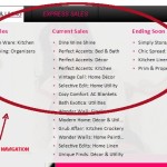
One thing that must be kept in mind while designing is the visibility of navigation menu so that clients may move from one page to another easily and quickly. The simplicity of navigation menu can be kept intact through use of drop-down categories which will help in better organization of clients who have many products. The menu should also include a Help or FAQ tab so popularly asked questions can be easily searched for by the customers.
#3 Home page promotional:
Home page is the perfect place for you to advertise current promotional events of a company- whether store wide savings, discount on specific items or free shipping. The event should be further illustrated with product images along with brief, snappy descriptions. The subsequent images of slideshow may contain other hot items.
#4 Visible testimonials:
Having a separate page for testimonials has become a little outdated. Instead testimonials are being incorporated by designers on product pages or the home page itself. However, if there is a testimonials page included separately then the previews of the testimonial should be shown on home page. One thing that must be remembered is that they are not product reviews but company reviews and the two are quite different. Testimonials focus around the customer satisfaction of interacting with the company. There are sites that allow customers the option to leave reviews through their social media profiles; in that case the profile image of the reviewer can be included as well since that will make the review more believable.
#5 Keeping the search bar within easy reach:
There are many who do not realize about the importance of search bar on ecommerce websites. Often customers come to some site to look at something in particular and if it cannot be identified clearly on landing page then they naturally opt to search for it. So the search bar should be made the key focus of the ecommerce website design. Users may even be tempted to search more, keeping them on the site longer.
#6 High quality large product images:
In Ecommerce websites there are no scope for the visitor to touch or see the actual thing until its delivery, so the customer has to buy with their eyes. To attract more business there should be enough photos. The product page layout should be planned out accordingly. The pictures should be of high quality since pixelated or blurry photos will result in disappointing the customer. The images should be thus large enough with good resolution so that the product can be discerned easily. They should be optimized so that web page loading is fast. Thus the images should be kept at 70kb. Each product should have a minimum of 2 angles in case of each product. The product page can have the pictures as thumbnails to be viewed at larger sizes when so desired. You can also show off the products through videos. You can include TV ads of the product, videos on how the product can be used or the making of the product.
While it is all well and good to follow tips and tricks to make your ecommerce website design attractive, do not forget to add your unique touch to your website. The site should have some personality and at the same time should be easy to navigate. Make sure that you make the experience as effortless as possible through your service, costs and shipping so that the customers keep on coming back to your site.
Summary:
Through ecommerce websites, the journey to checkout becomes easy and quick. To ensure that the customer likes the shopping experience and keeps buying from your shopping portal and not from your rival, here are some ecommerce web design tips to help you out.


Very useful tips for a shopping cart development. Keep pouring this kinda informative articles. Thanks.