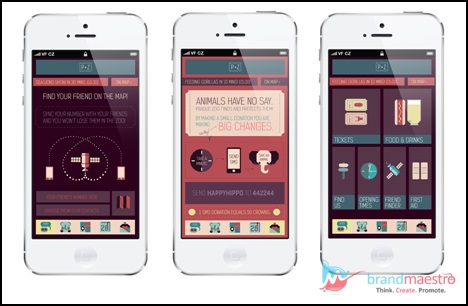
Superb Single Page UX Design with These Simple Steps
Informative, thoroughly professional and lacklustre – these words were commonly used about single page websites a few years back. But, the scene is really different now. The concept of single page design has received an overhaul and is considered pitch-perfect for a functional mobile app design. It helps to create an uncluttered and a visually striking design with eloquent, short and snappy content. If you are going to build a single page UX design for a business website and need some guidance, this blog post may help you. I will also tell how to get it right. You just have to read on.
Why businesses plump for single page UX design?
When you know how this design contributes to the success of a business, you will be able to come up with a better work.
Although a single page UX design has its share of both advantages and disadvantages, there is no doubt that it has turned out to be the most user-friendly design. Every business owner wants to implement something that caters to a large number of users. There is more than one factor that will enable you to choose this design for your business website.
Such websites are successful to acquire higher conversion and sales rates in comparison with websites having several pages. There are good reasons for that. At first, a user can find everything clearly designed at one place. Unlike a traditional website, a user need not visit different pages for different information. Secondly, this design works efficiently across all devices because of easy navigation. For mobile app design, it is the most ideal. Last but not the least, since the content is designed clearly and briefly, businesses find it easier to convey their message to the users. That is why; a single page UX website design is considered a smart approach.

What it takes to create a stunning single page UX design?
Now, it is about the main topic i.e. how you can nail the design. In a single page design, you have to convey all in just one page. So, this is a big challenge. Let’s find out how you can do so.
Keep it short, simple and engrossing :
Exploit your creativity to come up with smart ways to express succinctly. An effective technique is having several sections to place content to prevent the design from being messy. Keep the size of content same across all sections to maintain a harmonious look throughout the page. Make use of vibrant colours (not gaudy) and select good quality images relevant to content. This is adequate to grab the attention of readers.
Simplicity does not mean plain and boring. It is possible to create a simple yet stylish and eye-catching single page website or a stunning mobile app design when you have and CSS3the latest version of HTML i.e. HTML5. With the help of these two standards-based technologies, you can design your site with beautiful animations.
Implement a traditional navigation system :
In the first step, it was all about how to draw in visitors to a single page website. Now, in the second step, you have to ensure that users do not face any difficulty while exploring the site. It is a smart and wise decision to employ a traditional navigation system along with scrolling. Place a fixed navigation bar right at the top of the page to make the site more user-friendly. This navigation bar is a must feature in a lengthy single-page website. Users can swiftly get back to the top of the page with just one click.
Do not miss the call-to-action feature :
You have done your bit to make sure that users navigate the site easily. In the third step, you have to ensure that the website is properly designed to give high conversions. A strong call-to-action (CTA) feature will do that. CTA helps to get user feedback which is crucial for the development of a business. Its presence helps a business to know from their target audience whether their products or services are up-to-the-mark or need to be improved. On the basis of such response, businesses can craft their products and services according to the requirements of their potential customers.
If you are confused regarding which call-to-action is right for a particular site, you can carry out an A/B test to make the right choice.
Ensure high loading speed :
The presence of all business information in just one page often makes a single page website slow. The main reason for this is the stuffing of too much information, images and animations. You should steer clear of it and put in your best efforts to keep the design light by including the required amount of content. Poor loading speed affects user experience and is an obstruction in the path of achieving good conversions.
These are the four simple steps to design the most stunning and easy-to-use single page website or an amazing and user-friendly mobile app design.


Leave a Reply